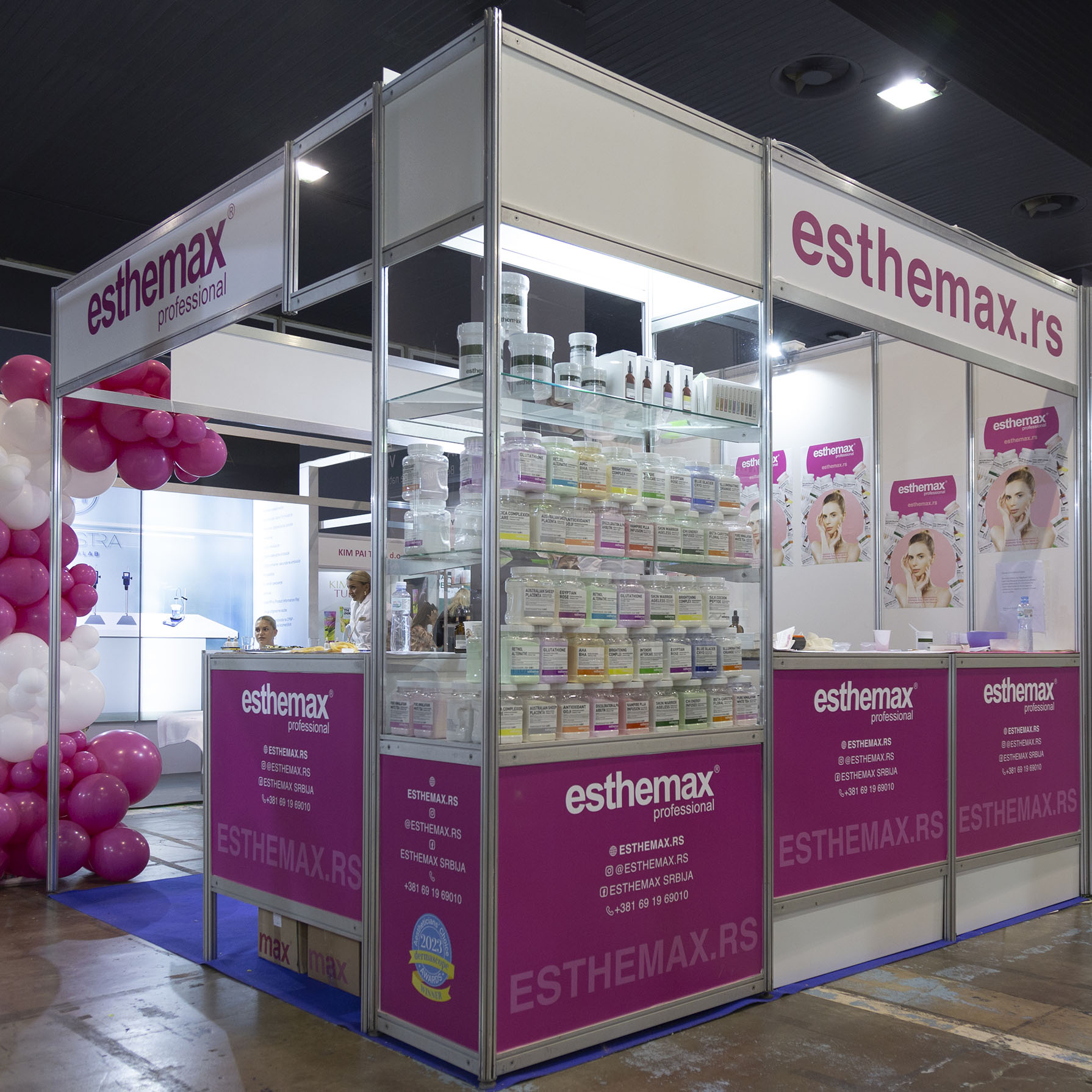
I designed the stand according to the existing fair elements, the dimensions that were sent to me by the fair organizer.
The stand was leased on 9m2 and it was necessary to organize the existing elements within that space, so I accordingly chose 3 typical counters and one glass shelf.
I wanted the stand to look elegant, so I avoided branding all surfaces. In the last days before the fair, we were informed that the existing elements were changed, so the printed surface of the glass shelf is significantly lower compared to the height of the counters. Therefore, the final appearance was not as planned.
For those who, like me, have experience with branding and design at trade fairs, chaotic changes at the last minute are not a surprise, so even though the stand did not look as I designed it in the end, the Esthemax brand had a successful first exhibition activity at the Belgrade cosmetics fair.

The counters at the fair in previous years were the same height as the glass shelf, so I designed the lower part of the shelf and the counters accordingly. This year the counters were changed at the last minute, so they were higher. The visual continuity I planned to be in the pink color turned out to be irregular. Moreover, the pink carpet somehow turned into a blue color.
The balloons were a bit off as I gave instructions that they should be fixed to the standing pole of the stand.
The sketch without balloons was done in the Sketch Up web 3D application.


However, the friendly and pleasant beauticians contributed to the atmosphere at the stand and the exhibition was very successful.
In the end, I was satisfied with the performance, and the stand really stood out.